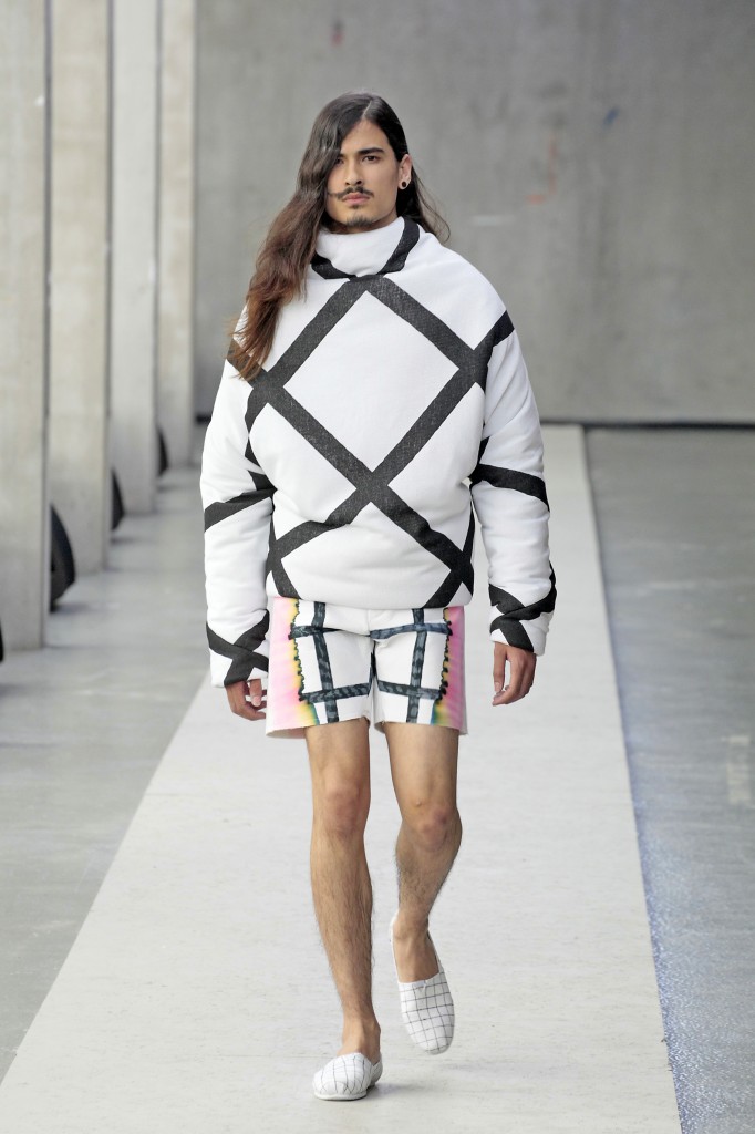
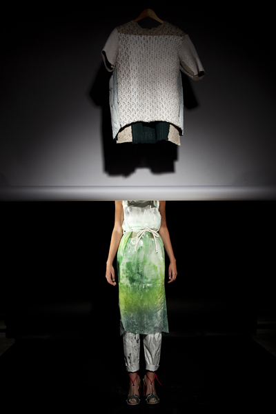
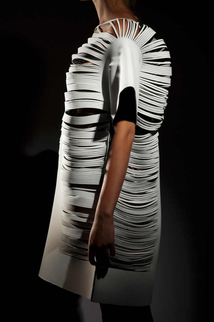
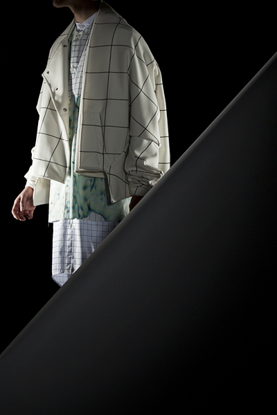
As the rookie fashion theory teacher at the fashion department of the infamous Gerrit Rietveld Academy in Amsterdam I am especially proud of ‘our’ first fashion show, held on Friday June 15. The brand new head of this fashion department Niels Klavers picked an excellent location for starters, on the third floor of the academy’s new wing across from the famously stylish Gerrit Rietveld building which served as a backdrop for the 45 meters long minimalist catwalk, a fruitful collaboration with Audio Visual students Kristinn Gudmundsen and Peter Sattler, Foundation Year student Karim Adduchi and other students. The show included a fascinating selection of first and second year fashion students, three fashion graduates – Jolka Wiens, Poul Brouwer and Morta Griskeviciute – and two more graduates, Elisabeth Leerssen from textiles and Torfi Fannar Gunnarsson from audio visual. Here is a selection of first reviews of the show by Kristoper Arden-Houser on Diane Pernet’s A Shaded View On Fashion site, prominent Dutch fashion reporter Georgette Koning and fashion blogger Branco Popovic. See the finale here on YouTube.
The runway pictures are shot by by the infamous Peter Stigter and Jetty Ferwerda team, always loyal to budding talent, here with a bow to the lovely Schoon den Boer PR team.
For the graduation paper we did in collaboration with graphic design student Aude Debout, photography student Kyle Tryhorn I interviewed the three fashion graduates of 2012.
MORTA GRISKEVICIUTE (24) studied graphic arts, graphic design and fine arts, at three different academies before arriving at the Gerrit Rietveld Academy Fashion Department. The journey started in her hometown Vilnius in Lithuania, and via Antwerp and Brussels Morta arrived in Amsterdam to discover the third dimension.
“It all collided. Fine arts interested me but it lacked the pragmatic aspect that I find in fashion. I like fashion because you have the creativity with the technical side and working in 3D, which is something I was searching for.”
“The photographer who inspired my graduation collection and whom I chose as the subject for my thesis paper is Robert Polidori. He is a Canadian photographer known for making photographs of decayed, barely visited places, focusing mainly on interiors. New Orleans after the flood, Chernobyl, Beirut. But also the opposite like for instance Versailles. In his stunning large-scale images the chaos of destroyed homes looks almost appealing. They are the main inspiration for my collection. Mistakes are always allowed, it is about: finding ways to make ugliness look beautiful.”
“I decided to stick to certain textures and materials, which I had researched and worked on. There were so many accidents that determined the outcome. My collection is like the way I draw my illustrations; expressive but also controlled. I combine many materials in one garment, a lot of different textures and prints. There are plastics and knitwear and for instance inside a sleeve there is yet another material. It is about the combination of something trashy and something contradictory, something that is very clean. The materials I used are: a marble print, altered knitwear, wallpaper, furry flocked plastic, painted fabrics, a ‘dirt’ print, a ‘wallpaper’ print, dark gold foil, and in combinations white cotton and many shades of various greys.”
“As far as I need basic fashion shapes, this is just for the sake of contradiction. I tried to reach for a certain looseness and expression in garments. The shapes merely resemble familiar skirts, t-shirts, or a coat. But the sweater is the shape of a T-shirt and the T-shirt has the sturdiness of a jacket. Something that is supposed to be thick and sturdy is for instance very thin and supple. Everything looks quite wearable. In fact most of the pieces are impossible to repeat a second time and therefore could be considered as unique items”
“The collection is non linear. A material will also occur in another outfit but then it has changed. For instance I used real wallpaper, but in another look you see the same wallpaper printed on fabric. So there is a dialogue between the two looks. Or even in one garment, like these pants with a real wallpaper waistband but everything falling down from it is the wallpaper printed fabric. You don’t see the transition.”
“For me designing has to be immediate. It is the natural way of working for me being an illustrator. I always try to reach this fluency I have as an illustrator when I am designing. However I do like a beautiful finish, well-executed clothes.”
JOLKA WIENS (27) originally hails from Berlin and while doing a year of volunteer work at a children’s farm in Venlo in the south of the Netherlands a friend brought the Gerrit Rietveld Academy to her attention. In fluent Dutch she explains how she was sure to study something in the direction of design but had yet to discover the lure of fashion.
“I am not your typical fashion person. I was never occupied with labels and such. What I was interested in is how to express myself on a creative level. Clothing is a great medium that everybody relates to; we all wear clothes every day.”
“I am mostly excited about the psychological and social aspects of design. The way people behave and communicate. The way we dress is also a means to communicate. I like to process materials, looking at the expression of fabrics, and I love knitting. I have done a collection about paranoia for instance where I used knitting in elastic, cobweb like structures pulled over regular garments. That was pretty dark.”
“I like to work in a raw, sketchy manner. One can argue whether this is sophisticated or wearable enough. For instance I’ve used spray paint on delicate and pliant fabrics to harden them. The message is more important than the practical side but I always make sure I add really wearable items like jumpsuits, body’s or leggings. I do see fashion as an art form, but if you can’t wear it you can’t experience it, and the body is crucial to fashion design. Especially in my graduation collection; the pieces are totally flat and literally need a body to bring them to live.”
“My thesis was about facial expressions. I studied the psychological aspects of facial expressions, and what is so fascinating is that there is this basic shape of the face yet even the slightest twitch completely changes its mimicry. However, applying this study to my collection I choose to keep it abstract and focus on the system of muscles and skin. I made drawings of faces and abstracted them the way they do in computer animation. This in the end resulted in the laser cutting technique used on flat, T-shaped neoprene.”
“The laser cutting technique was completely new to me. I design directly on the body using moulage. This has to be translated into a flat pattern, which then has to be reproduced in Illustrator so ultimately you can laser cut the design in fabric. The laser cutting itself is done in no time, 20 minutes to an hour, but it is very intense, sometimes you have to intervene to get it perfect down to the millimeter. Luckily last year Rietveld got its own laser cutter. There is one that you can use at the textile museum in Tilburg and one in the Fablab at Pakhuis de Zwijger in Amsterdam. But they are ‘open source’ which means you donate your design for others to elaborate on. This is a great thing, but maybe not for a graduation project.”
“New technology always take time to tickle down into the mainstream but I am convinced it will. Who knows, maybe we will all own a 3D printer in ten years from now. For me as a designer this is definitely my future: experimenting with and designing from new materials and techniques.”
POUL BROUWER (24) was wisely motivated by his mother to apply at the Gerrit Rietveld Academy where he ended up studying for six years including an orientation course and a year of preparatory training. Mothers know best, judging by his graduation menswear collection inspired by SHAME.
“At first I was into photography. But then I followed the fashion course during my first year and I was immediately hooked. I loved actually making something, working with materials and relating to the body. And even though I had never really sown anything before in my life I found I was good at the technical side of it as well. I am quite a perfectionist.”
“All the concepts I have worked on these past years are strongly related to what was going on in my life at the time. Very personal issues like craving for a boyfriend, which I used for a denim assignment, or the fact that I am a redhead due to a minor mutation in my genes, which I used for a project on red. My graduation collection and my thesis are inspired by an alarming sense of shame that I relived when I was flipping through a childhood photo album. In two pictures in particular I can tell I felt caught red handed by the camera. I recall the sense of shame I experienced as a child, secretly playing or listening to certain music like my mother’s Spice Girls cd. I was well aware that my preferences were not exactly the norm.”
“To me SHAME is about the covering up of ones true identity, and therefor loosing this identity. On a very uninspired day I was smoking under the lean-to outside. It was raining and I noticed how the water ran between the tiles, changing the colours and smoothing out the grid. I reproduced the grid on a white cotton fabric with a black marker and soaked it in water expecting the lines to become faint. In stead something marvellous happened. The black lines turned into beautiful colours running into one another. This was a real eye opener as I instantly recognised myself; I am in fact a very colourful person even though I may look just as serious as those black lines did.”
“Looking for the shape of SHAME I started wrapping myself in blankets and taking pictures. Then I got myself a ‘Ken’ Barbie and continued my search for shapes working on him with little scraps of fabric. It felt really appropriate as I used to play with Barbie dolls as a kid. This approach resulted in a series of coats and jumpers. All garments are basically made out of one piece of fabric and certain features like seams twisting around the arm or typical folds and pleats are also directly derived from the wrapping technique. Ultimately you get to a point in the design process where you have to translate experiments into real garments by adding details such as pockets and finishings. To complete the looks I looked at them as compositions, which I had to balance out. That is why for instance the front and the back of certain garments differ in length. The looks became very layered which also relates beautifully to the SHAME theme.”
“When I go shopping I can hardly find anything I like. I would like to be able to show a different menswear fashion, with different proportions, less rigid. I find Muslim men very inspiring for instance, the way they wear their long robes with sneakers. I can sense a need for a looser, longer and wider way of dressing.”
Tags: Elisabeth Leerssen, fashion graduate show, Gerrit Rietveld Academy, Jolka Wiens, Morta Griskeviciute, Niels Klavers, Poul Brouwer


